


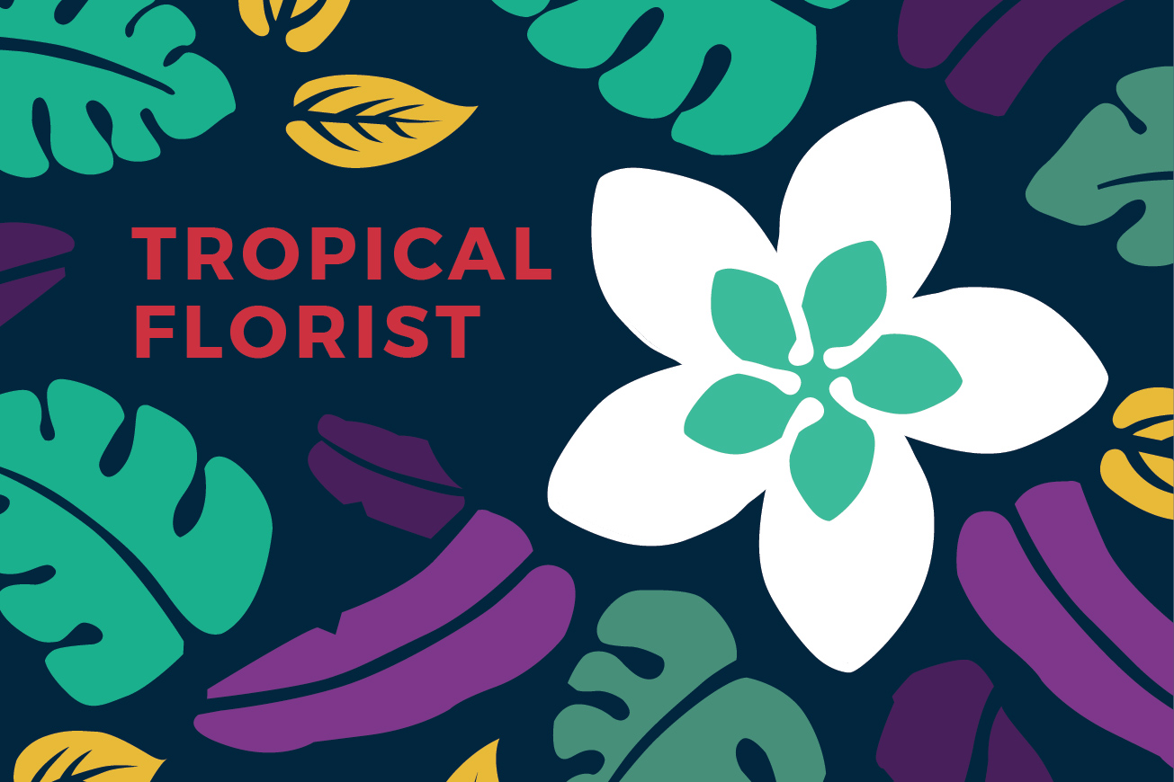
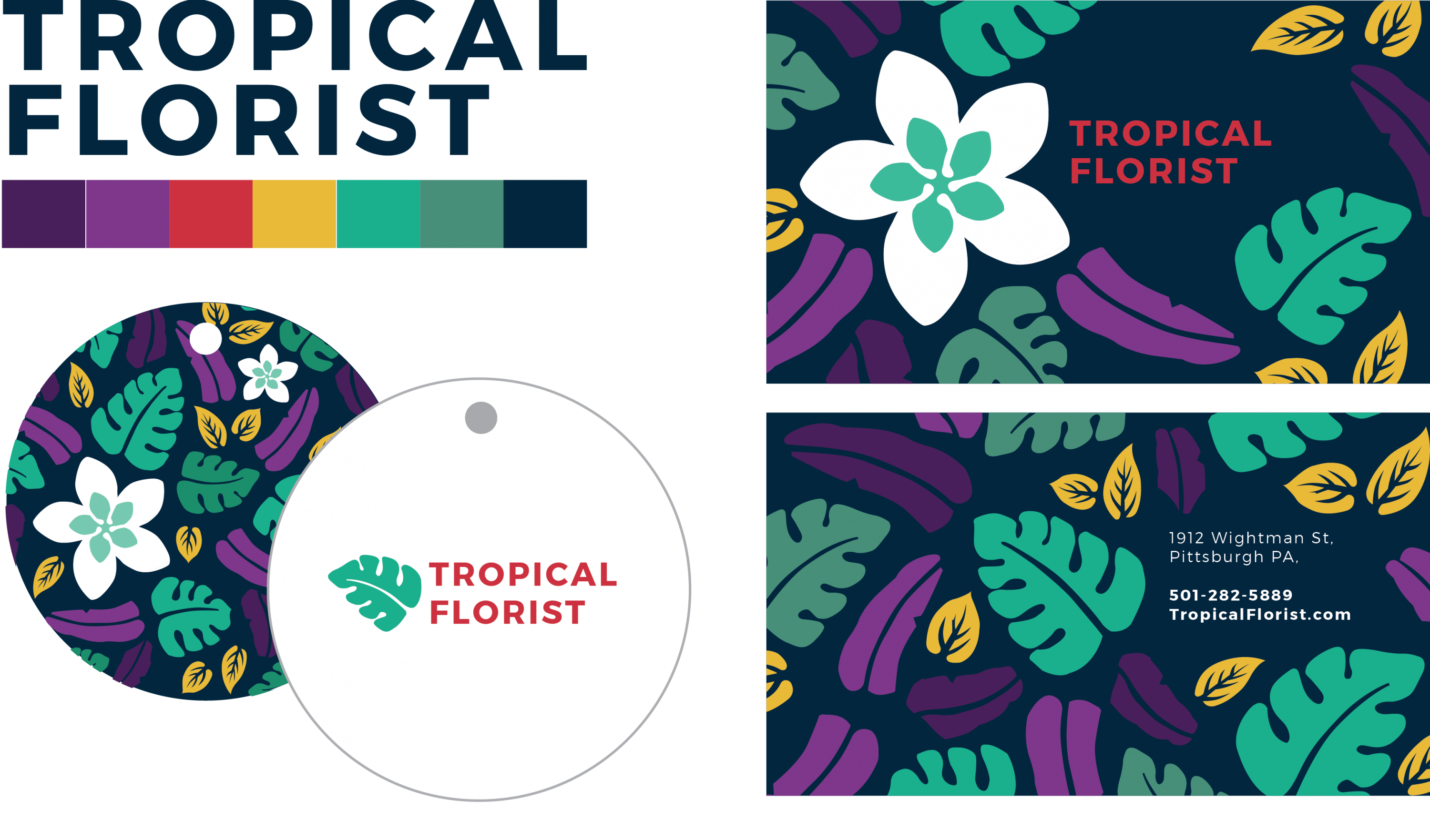
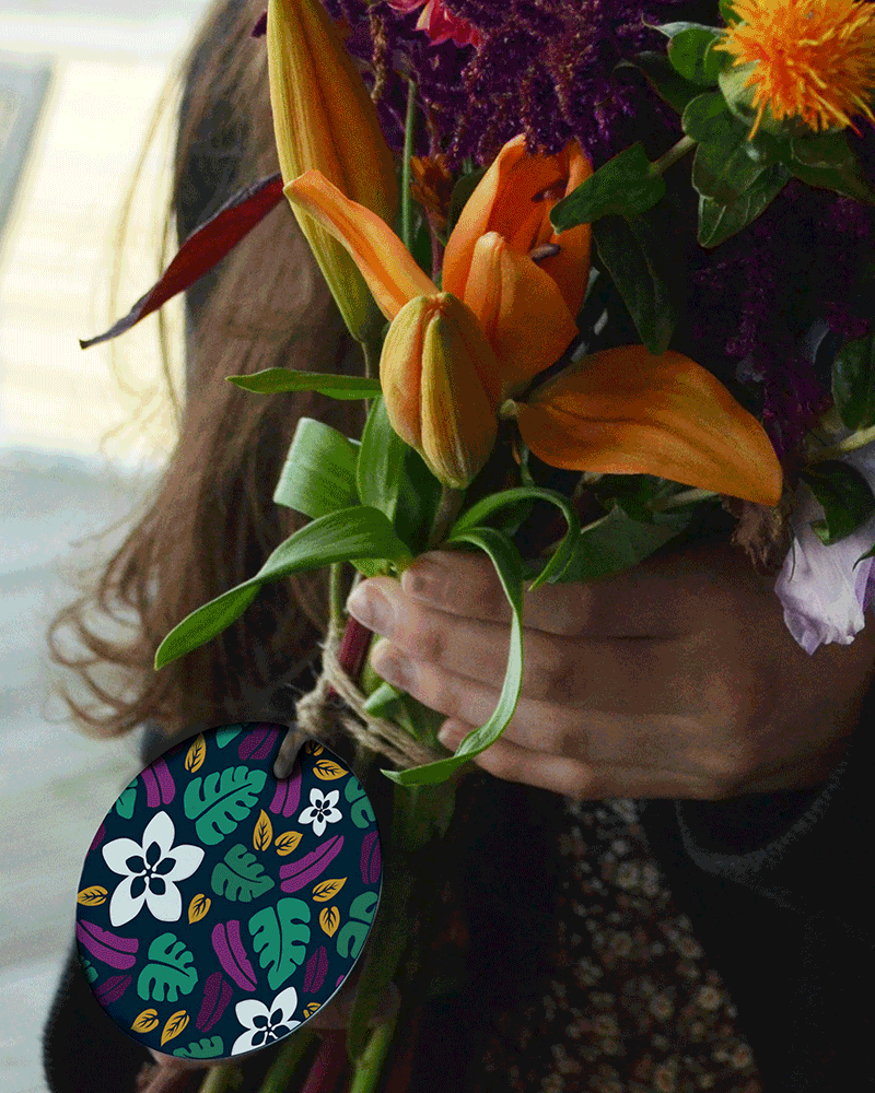
Tropical Florist
In an exploration of color in the natural world, ‘Tropical Florist’ was designed as a branding system for a proposed florist shop. The identity system includes a color palette, iconic pattern, business cards, flower tags, and a poster featuring an event of the flower store. This project posed a unique challenge, because it began with the inspiration of flowers as the basis of the branding scheme, instead of a prescribed company or identity.
Process
The objective was to use color to convey a feeling as well as an identity. First, was an exploration of the form and color of flowers to find an inspiration of the identity. The Plumeria flower, with its strikingly white petals arranged in a perfectly radial form, stood out immediately. Plumeria flowers are primarily found in tropical regions; the contrast of its bright white and yellow colors against the deep greens of its environment is captivating. With this as the inspiration, the florist was imagined as a tropical flower provider. The rest of the branding scheme emerged from the bold colors and patterns found in tropical foliage where the plumeria blooms. I began with cut paper patterns to mimic the strong form and bold colors of this foliage. The challenge of creating this branding scheme was discovering a color palette that communicated the deep colors under a rainforest canopy, as well as the saturated flora in the environment. The cut paper prototypes evolved into a pattern that affords the brand option of application, such as business cards and labels. As a proof of the system, I designed a poster that the florist may use to advertise new flower arrangements.