


The Challenge
Throughout our day we sift through a constant stream of information encountered in the digital environment. A large portion of that information is news and current events. At the quantity we consume, the issue of fake news on social media platforms, such as Facebook, poses an dangerous problem for the digital user. Through design research my team, Noah Johnson, Tiffany Jiang and I, sought to define the problem with news delivered on social media. Through research and data visualizations we communicated this issue in a digestible way. Using ‘Twitter: Moments as our test case, we then designed an intervention for this problem.
The Problem with News Delivered on Social Media Platforms
As we conducted research, we discovered two poignant issues with news delivered through social media. First, the digital preview of a ‘news article’ is visually presented following heuristics of a physical newspaper. This confers a level of authority to the content, but the information could be invalid or non-news related altogether. Secondly, the content of these news articles are not always verify or valid, and may even be created by the user.
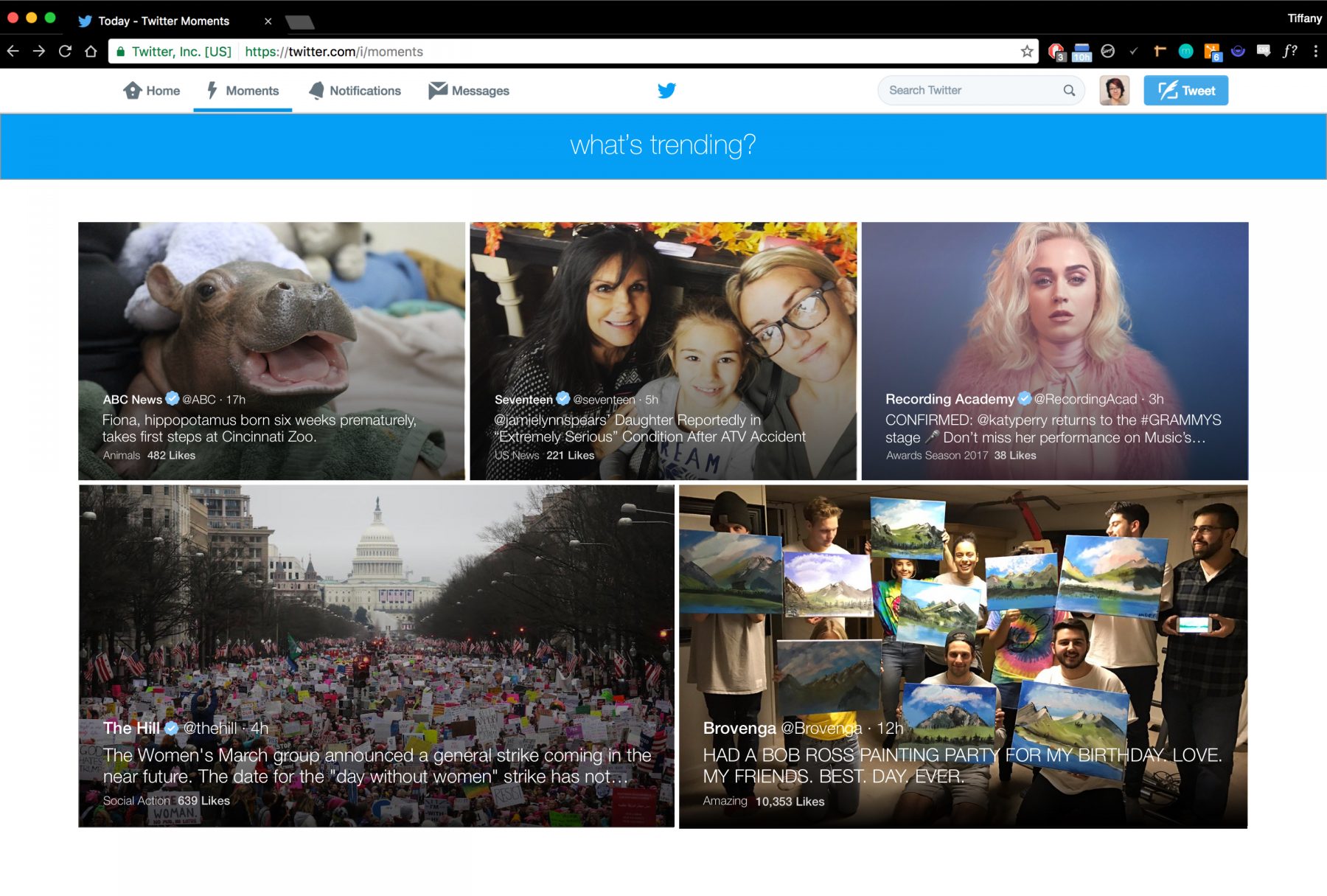
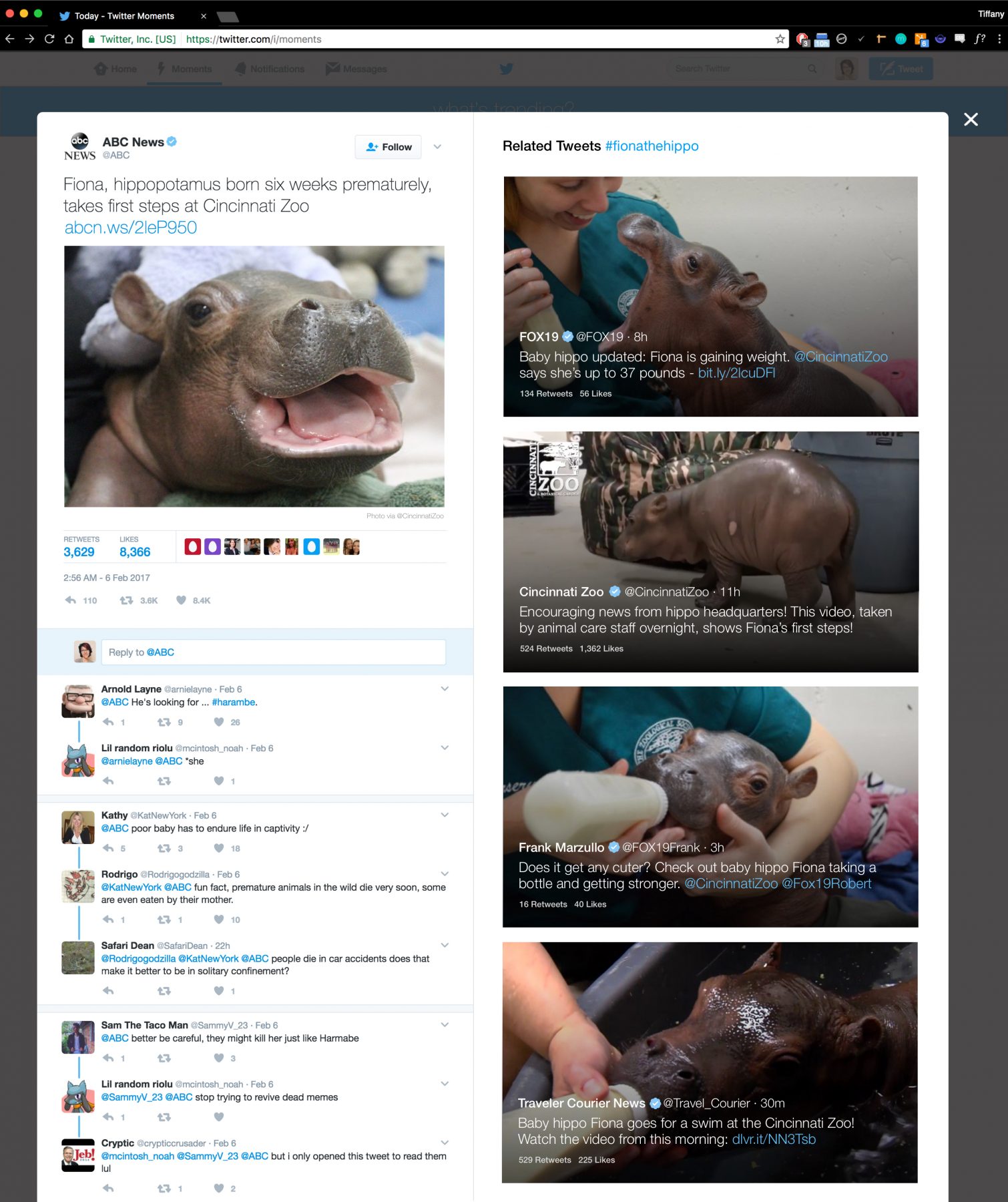
Twitter Moments is the epitome of this paradigm happening across social media platforms today. When Moments first launched, Twitter marketed it as a place where users could consume casual news at a glance. However, by using the visual presentation of news-article previews to the content, they have unintentionally mislead their users into interpreting it as valid and verified news. When one clicks into a Twitter moment, the content provided is no more than one sentence longer than the caption showed in the preview. This is an obvious disappointment for users expecting to read the article they just clicked on.
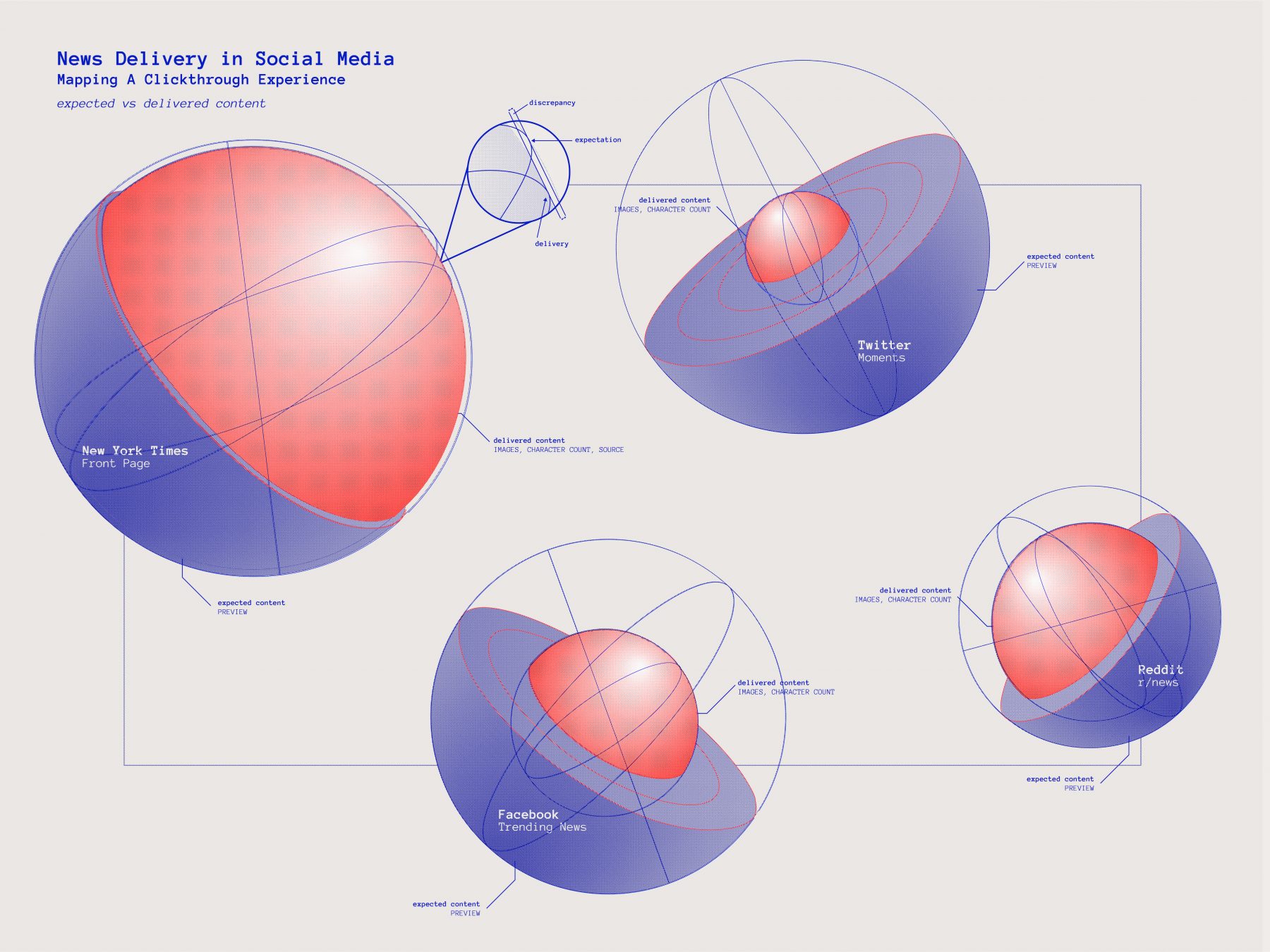
Representing Our Findings
With this as the jumping off point, my team and I took the research we had found on social media platforms, Facebook, Twitter, and Reddit, and we compared it to New York Times digital representation of news. To represent our findings we designed a poster that features a globe for each of these research cases. The outer skin of the globe represents the expectation formed by the preview of the article content. This we quantified by estimating the visual hierarchy of the preview against that of the typical newspaper post. Note that Reedit is smaller than the rest because the interface is unassuming and sets no “high” or news-like expectation of the content. The inner globe represents the amount of valid and verifiable content that would meet the expectation of news. Each successive growth of the inner globe is dependable on the combination of two attributes: the amount of content delivered and how often the source is valid. At a glance it is apparent that despite the the appearance of Twitter’s Moments, the delivery of satisfactory content is very low.
Intervention
Our intervention targeted the main failing of digital news that we identified: the misleading visual representation for the user. In the case of Twitter Moments the user sees the news-like preview of each topic and will expect an actual article, but in reality each moment is no more than a glorified ‘tweet’. To honestly represent the content Twitter is providing, we designed an interface that presents each topic to look more like tabloid news. Using precedent of digital tabloid-like news such as snapchat, we designed the news-cards to visually feel more casual and browsable. When a user clicks into a moment they will be directed to the original tweet, instead of the current algorithmically paraphrased one. The user can comment on the moment, re-tweet it, browse related tweets, and/or follow the tweet author. This intervention re-configures Twitter Moments to represent themselves more honestly as a casual news source.